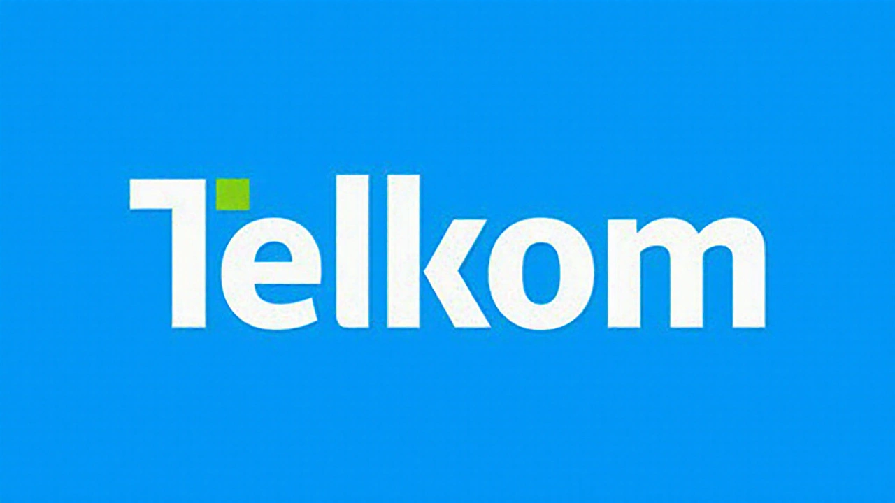
What the new "Dynamic T" looks like and why it matters
South Africa’s largest home‑grown telecom provider, Telkom, unveiled a complete visual overhaul this week. The centerpiece is the so‑called Telkom rebrand, featuring a stylised "T" split by a diagonal green line. The green cut runs from the upper‑right to the lower‑left of the letter, giving the logo a sense of forward motion. Alongside the icon, the company introduced a refreshed colour palette: the familiar corporate blue stays as the anchor colour, while a bright, almost neon green is added as an accent.
Design director Lindiwe Mthembu explained that blue continues to signal trust, reliability and professional expertise – values that have underpinned Telkom’s service offering for decades. The green, on the other hand, is meant to convey growth, change and a willingness to embrace new technology. By pairing the two, the brand hopes to project stability without appearing stuck in the past.
The diagonal slash is more than a decorative flourish. It is marketed as a visual metaphor for connectivity, upward momentum and the seamless flow of data across the network. In a market where speed and network coverage are hotly contested, the graphic tries to remind customers that Telkom is moving ahead, not standing still.
Financial backdrop, market pressure and the road ahead
Telkom’s timing for the refresh is noteworthy. In the last fiscal year the company posted a 62.4% surge in earnings, a performance boost driven by higher broadband subscriptions, a rebound in corporate contracts and cost‑saving measures after the disposal of its mast and tower subsidiary, Swiftnet. The cash surge enabled Telkom to announce a final dividend of R1.63 per share and a special dividend of 98 cents per share – a total payout of roughly R1.3 billion, the first dividend distribution in four years.
Chief Executive Officer Serame Taukobong framed the visual change as a response to “strained economic conditions and an intensely competitive telecommunications landscape”. He told reporters that while the logo is iconic, it needed a “dynamic” refresh to stay relevant to today’s customers who expect digital services, seamless streaming and fast mobile data.
South Africa’s telecom sector is split among a few dominant players – Vodacom, MTN, Cell C and the state‑owned Sentech – all of which have been rolling out 5G trials, aggressive data‑plan promotions and bundled services. Telkom’s recent focus on fibre‑to‑the‑home (FTTH) and the launch of its own 5G‑ready network are part of a broader strategy to compete on speed and reliability rather than price alone.
To cement the new brand message, Telkom is rolling out the tagline “Possible Begins Here” across all touchpoints. The promise is being communicated through pop‑up installations in major malls, universities and public squares. These temporary venues combine large‑scale visual displays of the new logo with interactive digital stations where visitors can test network speed, explore new service bundles and even create personalised “possible” statements that are printed on the spot.
Industry observers note that the event‑driven rollout is designed to create buzz and social‑media shareability, a tactic previously used by global tech firms during product launches. By making the rebrand a “movement”, Telkom hopes to shift perception from a legacy operator to a modern, customer‑centric digital platform.
Beyond the visual change, the company announced several operational initiatives. A new customer‑experience centre will open in Johannesburg, offering face‑to‑face support for both residential and enterprise clients. Internally, Telkom says it is consolidating its brand guidelines across consumer and business divisions to ensure a consistent look and tone, whether you’re looking at a broadband bill or a corporate solution brochure.
Analysts at Africa Securities have upgraded Telkom’s outlook, citing the rebrand as a catalyst for stronger market positioning. They argue that a fresh identity can help attract younger, digitally savvy customers who might otherwise gravitate towards the more “hip” offerings of competitors. Likewise, investors are watching to see whether the visual refresh translates into measurable gains in subscriber numbers and average revenue per user (ARPU).
In the broader context of South Africa’s digital agenda, the government has set targets for universal broadband access and the rollout of high‑speed networks in underserved areas. Telkom’s emphasis on fibre and the “Dynamic T” signal aligns with national goals, potentially opening doors for public‑private partnerships and infrastructure funding.
While the new logo is the most visible element of the shift, the underlying message is clear: Telkom wants to be seen as an enabler of possibility. Whether it’s a small business setting up an e‑commerce platform, a student streaming lectures, or a family watching on‑demand content, the company hopes its refreshed brand will sit at the heart of those everyday moments.
Only time will tell if the "Dynamic T" can move beyond the design board and become a genuine driver of growth. For now, Telkom has placed the bets, tied a fresh visual identity to solid financial results, and launched a nationwide campaign that aims to turn curiosity into loyalty.


Posts Comments
AAMITESH BANERJEE September 27, 2025 AT 02:59
I mean, the new T looks like someone took a Sharpie to a corporate logo and said 'this is now modern.' But honestly? The green cut gives it motion. I get it. They’re not just selling internet anymore-they’re selling possibility. And honestly, that’s smarter than another blue square with a phone icon. I’ve seen too many telcos try to look like Apple and fail. Telkom’s just trying to look like itself, but upgraded. Respect.
Akshat Umrao September 27, 2025 AT 15:34
The green is kinda neon 😅 but I like it. Feels like the future is finally here. Also, R1.3 billion in dividends? That’s wild. Hope they don’t forget the rural folks while chasing 5G in Joburg.
Sonu Kumar September 28, 2025 AT 18:41
The 'Dynamic T' is a desperate attempt to appear innovative while clinging to a legacy brand that still uses fax machines in some offices. The diagonal line? A lazy metaphor. Connectivity? Please. Real connectivity is when your internet doesn’t drop during a Zoom call. And yet, here we are, applauding a logo change while the actual infrastructure crumbles. This is branding theatre, not transformation.
sunil kumar September 29, 2025 AT 16:48
The financials are impressive-62.4% earnings growth is not trivial. However, the rebrand raises a legitimate question: does visual identity correlate with network quality? In markets like India, we’ve seen flashy logos with subpar service. The real test will be whether the 'Possible Begins Here' slogan translates into consistent latency, coverage in townships, and customer service that doesn’t require a three-day callback. Without those, the green line is just ink.
Deepti Chadda October 1, 2025 AT 10:06
Finally someone in SA is making a move 🇿🇦🔥 No more copying Europe or the US. This T? It’s African innovation. Telkom’s not just a company-it’s a symbol. And the green? That’s the color of our future. Vodacom can keep their boring blue. We’re moving forward.
Anjali Sati October 3, 2025 AT 06:13
It’s just a logo. And they’re spending millions on pop-ups while people still can’t get decent 4G in Limpopo. Do you think a neon T fixes broken towers? No. It just makes you feel better about paying R1,200 for 10GB.
Preeti Bathla October 3, 2025 AT 13:14
Okay but the green is literally the color of envy 💚 and the logo looks like it was designed by a high school intern on Canva. And don’t get me started on 'Possible Begins Here'-it’s the most cringe tagline since 'I’m a Mac, I’m a PC'. Also, R1.3 billion in dividends? Who’s getting rich here? The shareholders? Not the customers. 🙄
Aayush ladha October 4, 2025 AT 05:48
Everyone’s acting like this is the second coming. Newsflash: Telkom’s still the same company that charged R999 for 10GB last year. The new T doesn’t change that. If anything, it’s a distraction. The real innovation? Not having to pay extra for Wi-Fi in your own home. That’s the real 'Possible'.
Rahul Rock October 5, 2025 AT 16:30
There’s something poetic about a diagonal line cutting through a static symbol. It’s not just a logo-it’s a statement. The past is being sliced open to let light in. But I wonder: if the T is dynamic, what’s the rest of the company? Are the call centers still stuck in 2010? Are the engineers still using spreadsheets to track outages? A logo can’t fix broken systems. But maybe, just maybe, if the symbol is bold enough, it’ll force the people behind it to become bold too.
Annapurna Bhongir October 5, 2025 AT 19:20
Logo change. Dividends. Pop ups. All noise. Real question: did they fix the app?
Write a comment